One week ago Gap pulled off either the biggest blunder in branding history or one of the most brilliant moves ever...
I agree the Gap logo needs an update but the logo to the right is clearly not the solution. The new logo barely provides a hint as to what the brand was/wants to be. The outcry against the brand was fast and furious making Gap a trending topic on twitter in recored time. The brand even trended above Brett Farves...*ahem* so needless to say the new logo created a stir.
The Problem:
Gap as a brand has been loosing relevance year after year. Brand sentiment was at a near all time low, and this problem had nothing to do with bad press. Gap stopped being remarkable, they stopped pushing the edge...in short they became the poster child for average.
Was it a stunt?
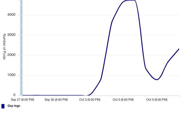
Gap an average brand that had lost their ability to be remarkable, found a way to do something pretty remarkable. The new logo pushed forward far too fast. The speed of change reminded people what they loved about this brand. Their loyal fans didn't want it to change that fast and they spoke up. This left Gap had two choices ignore the backlash which would indicate a true re-branding effort (ala Pepsi) or cave... 10 days after launch they caved... I cant say for sure it was or wasn't a stunt but this conversation timeline might tell the story...the timing on the decision to revert back is questionable at best... my guess next week they will have a new logo with a subtle update.
(Repost of my work from nostrum inc.)


